
SIMPLY FOOD TRUCKS
We do the planning. So you don't have to.
Food trucks made simple.
Originally known as Food with Purpose, Paige's food truck booking company had experienced significant growth, yet she recognized its untapped potential to become a highly profitable venture. Aware of the need for a rebrand, Paige was determined to invest in her business, seeking to establish a compelling and cohesive identity that would deeply resonate with her niche market. That's where our expertise came into play. With a fresh name, a new brand, and a well-crafted marketing strategy, we revitalized her company, breathing new life into its image and positioning it for greater success in the market.

BRAND STORY
Simply Food Trucks takes charge of the mobile catering arrangements for corporate event planners, community and municipal organizers, and sports team catering, ensuring the success of their events and leaving guests delighted with the food. They understand the challenges of planning events that truly WOW, and they know that the food can make or break an occasion. With Simply Food Trucks extensive experience in event planning and deep expertise in all things food trucks, they curate exceptional events that leave a lasting impression on even the most discerning guests. Rest assured, when you entrust your catering needs to Simply Food Trucks, your event will be nothing short of extraordinary.

LOGO
After presenting the client with four distinct logo concepts, Paige ultimately narrowed down her choice to two. After thoughtful discussion, she found herself drawn to the utensil concept, particularly the playful and inviting nature of the fork design. Through iterations and exploration of various color options, she opted for a concept modification that perfectly encapsulated the brand's identity.
The final logo emerged, featuring a vibrant combination of orange and yellow hues, with the fork taking center stage as the primary utensil representation. This bold and dynamic color palette, along with the iconic fork imagery, has since become synonymous with excellence in the food truck industry. As a result, the brand has experienced remarkable growth, becoming a trailblazer and achieving remarkable success in the industry, now valued as a million-dollar business.
CONCEPTUAL IDEAS



APPROVED LOGOS


DESIGN ELEMENTS
By drawing inspiration from a diverse range of street food offerings, the brand successfully captured the essence of its culinary adventure. The incorporation of various design elements, including color schemes and captivating photography, played a pivotal role in crafting a visual identity that perfectly reflected the brand's core values. The vibrant colors invoked a sense of excitement and liveliness, setting the tone for a fun and entertaining experience.
The use of purposeful and enticing imagery showcased the delectable range of food options, tantalizing the taste buds of potential customers. This harmonious blend of design elements ensured that the brand exuded an irresistible charm, effectively drawing in the target audience and creating a strong connection between the brand and its customers.


Sacramento
ABCDEFGHIJKLMNOPQRSTUVWXYZ
abcdefghigklmnopqrstuvwxyz
1234567890(,.;?!$&*)
Poppins
ABCDEFGHIJKLMNOPQRSTUVWXYZ
abcdefghigklmnopqrstuvwxyz
1234567890(,.;?!$&*)



BRAND ACTIVATION
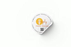
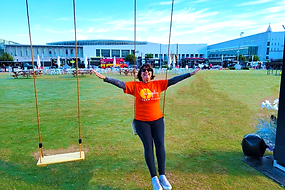
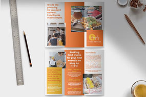
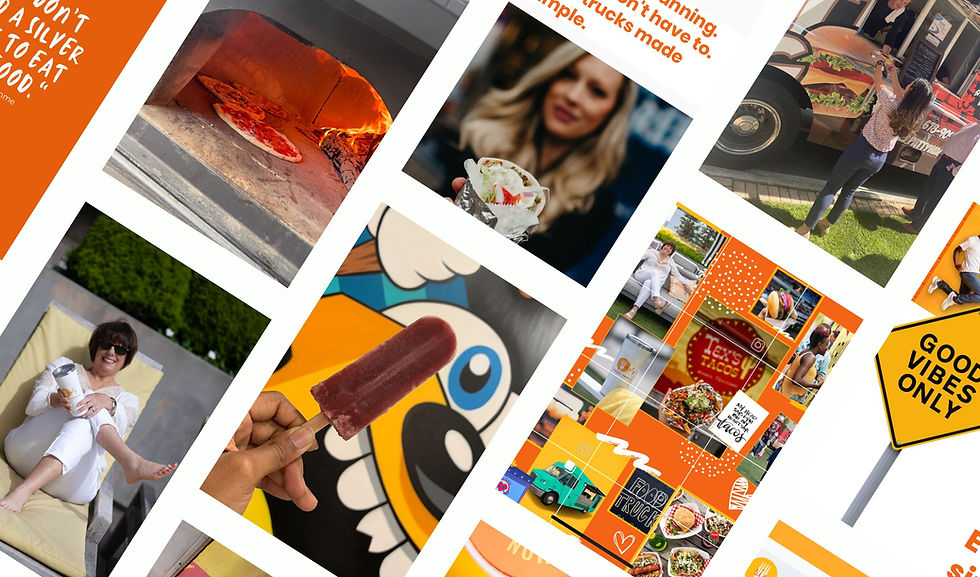
Brand activation ideas were brought to life, infusing Paige's marketing materials with the brand's creative culture and fun vibe. The focal point was a captivating new website, where the essence of the brand shone brightly. From there, the visual imagery seamlessly extended to every facet of Paige's business, including business cards, social media, flyers, and presentations. Clients raved about the consistent brand experience, with one Simply Food Trucks customer remarking, "Everything is on brand." This accolade served as confirmation that the brand activation efforts hit the mark, leaving a memorable and cohesive impression on the audience.


